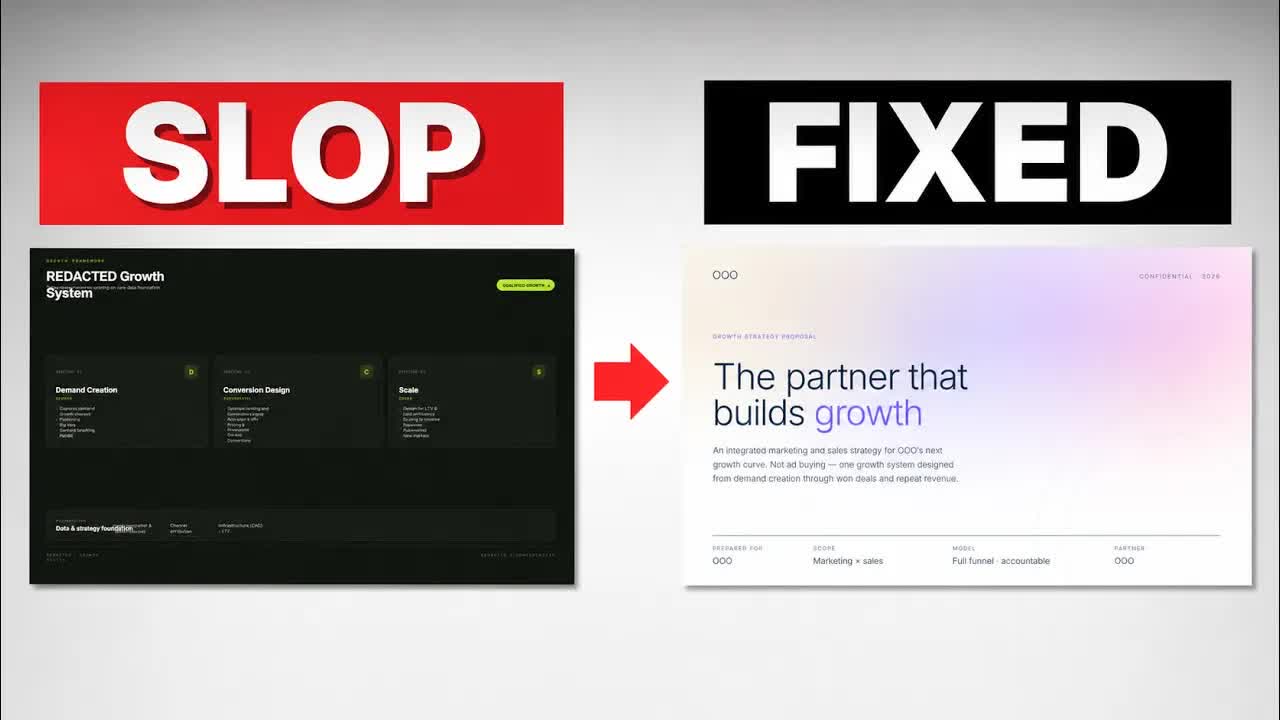
Ask any model for a pitch deck and you get the same artefact back: a neon accent color, three rounded blocks in a row, a vertical bar glued to the edge of every card. You have seen that deck. So has the person reviewing yours.
I spent my working life in venture capital reading decks for due diligence, and here is the part nobody tells founders. The reviewer is a human being before they are a rational one. Before I judged the product, before I judged the team, I had already decided whether I wanted to keep reading.
What follows is the AI pitch deck design prompt I use on real client work. Four blocks: guardrails, experience, design, assets. Same deck, ninety minutes apart, went from machine-generated to warm, textured and quiet enough to read. Nothing here is Claude-specific. I built it in Claude Code, but it works identically in Codex or Gemini, because it is a way of thinking rather than a tool.
What you'll get out of this
- The three visual tells that mark a deck as AI-made, and the one-line replacement for each
- Why your prompt should open with what the model must never do
- Why adjectives like premium, clean and handcrafted produce garbage every time
- Where to find an open-source
design.mdinstead of writing a spec from scratch - An honest account of what good design does and does not buy you
Why does every AI deck look the same?
A model's default output is the average of everything it has seen. When you describe a target, you get the average version of that target. So most of the work in a design prompt is not describing. It is closing doors.
Templates make this worse, not better. Templates are the reason every AI deck looks the same: everyone is pulling from the same tidy defaults, and the model optimises for tidy because tidy is safe. A box is the safest way to be tidy.
The three tells that give an AI deck away
Tell one: the accent bar. A thin vertical line in the accent color, stuck to the left edge of a card or a text block. In CSS it is border-left: 3px solid accent, and it is the single most recognisable thing a model makes.
The color rotates on a schedule. Right now it is neon lime. Before that it was copper orange. Before that, purple. The color changes every six months and the behaviour never does: one loud accent doing all the visual work, because the model has no other idea where to put interest.
Boxes and flat backgrounds
Tell two: the box grid. That same accent shows up again as section labels in neon caps. I counted fourteen of them on one deck. Then the containers: ten rounded rectangles on one slide, eleven on the next. Nobody names this tell because every individual box is fine. But a deck where every slide is the same grid of cards reads like a form, and you do not argue with a form. You fill it in and leave.
Tell three: no texture. Flat white or flat dark, and nothing else. No grain, no depth, no paper.
How the four-block design prompt is structured
The order is not decorative. Guardrails fence off the average before the model starts generating. Experience is the umbrella intent. Design is whatever is needed to produce that experience. Assets are what design refers to when words run out.
-
Write the guardrails first
Open with the bans, not the brief. Each ban gets a replacement so the model has somewhere to go.
-
Describe the experience you want
What happens to the person who opens this? Curiosity, or the urge to get out of it as fast as possible?
-
Specify the design
Color, theme, layout, font. Start from someone else's published
design.mdrather than a blank page. -
Hand it assets to study
Attach the images or the URL. Tell it to study them and get the gist of what you mean.
Block 1: guardrails, or what the model must never do
Everyone teaches you to start by describing what you want. I start with what the model must never do, because you are not describing a target. You are fencing off the average.
Block one is almost entirely nevers, and the single always is a replacement. I am not taking boxes away and leaving a hole. I am naming what does the job instead. A hairline rule does everything a card border does, and it does not announce itself while doing it.
# design.md — guardrails
NEVER accent bars on cards or text blocks. No exceptions.
NEVER neon accent colors.
NEVER box / card grids.
NEVER rounded rectangles as containers.

ALWAYS asymmetric grids.
ALWAYS hairline rules instead of card borders.
ALWAYS content sitting directly on the page.Type never and always literally. "Try to keep it minimal" is a suggestion, and the model will treat it like one. "It looks AI" is a useless instruction because it names a feeling, not a rule. Name the CSS property if you have to.
Block 2: experience, the block nobody talks about
This is the one I have never seen another AI creator cover, and it is the block I spend the most time on. Before layout, before color: what kind of experience does the person opening this deck actually have?
Are they simply observing information they need? Or are they being carried, getting the right thing at the right moment, never distracted or turned off by the layout? Does the thing evoke curiosity, or is it stale enough that they want out of it? Answer that in plain sentences at the top of your prompt, then let the rest of the prompt serve the answer.
What is your intention? What kind of experience do you want to create for the person you are giving this to? Decide that first, then be creative inside it.
Structurally, experience is the biggest umbrella. Design is whatever is necessary to produce it. Assets are what design refers to. Say it to the model in that order and it stops treating your color instructions as isolated preferences. Same logic I use when I wire a command center around a single intent rather than bolting features together.
Block 3: design, the spec rather than the vibe
Block two was feeling. This is the concrete layer: color, theme, layout, font.
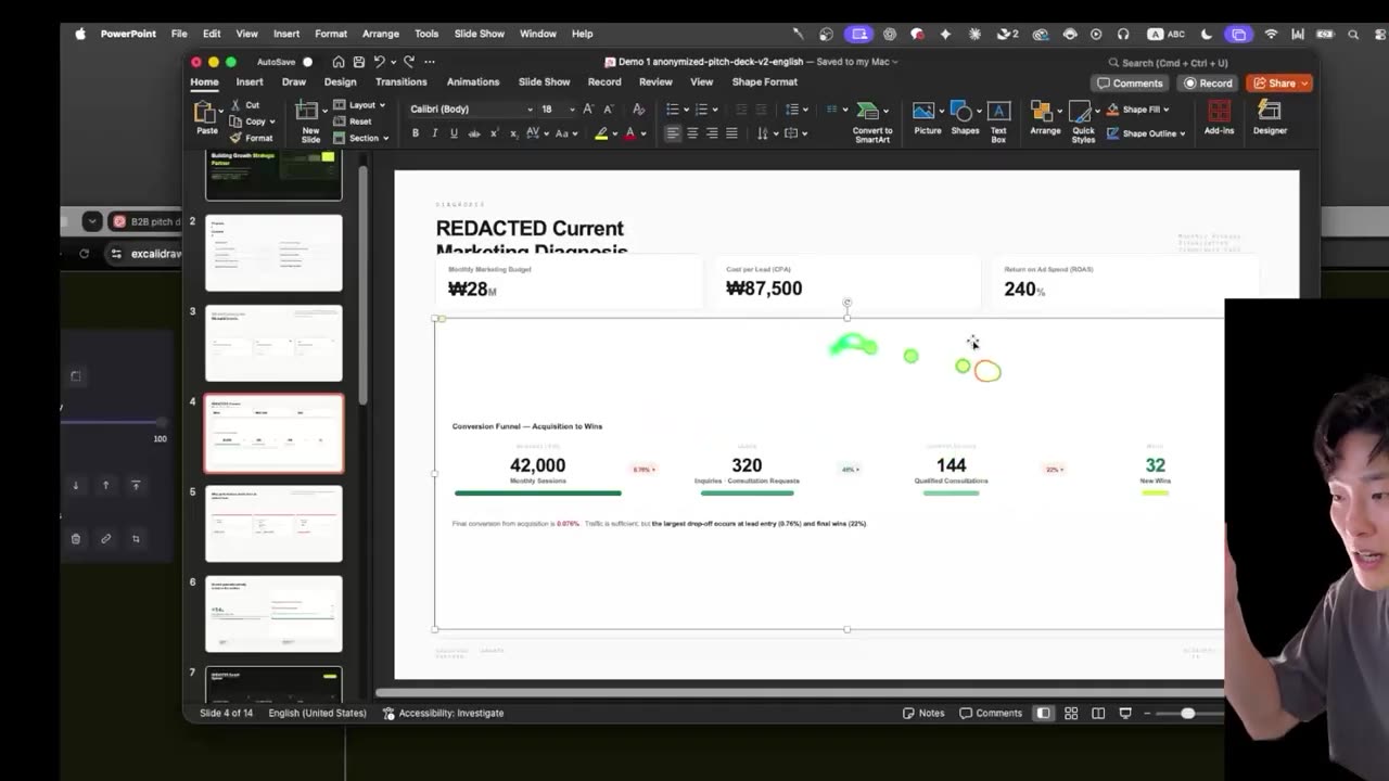
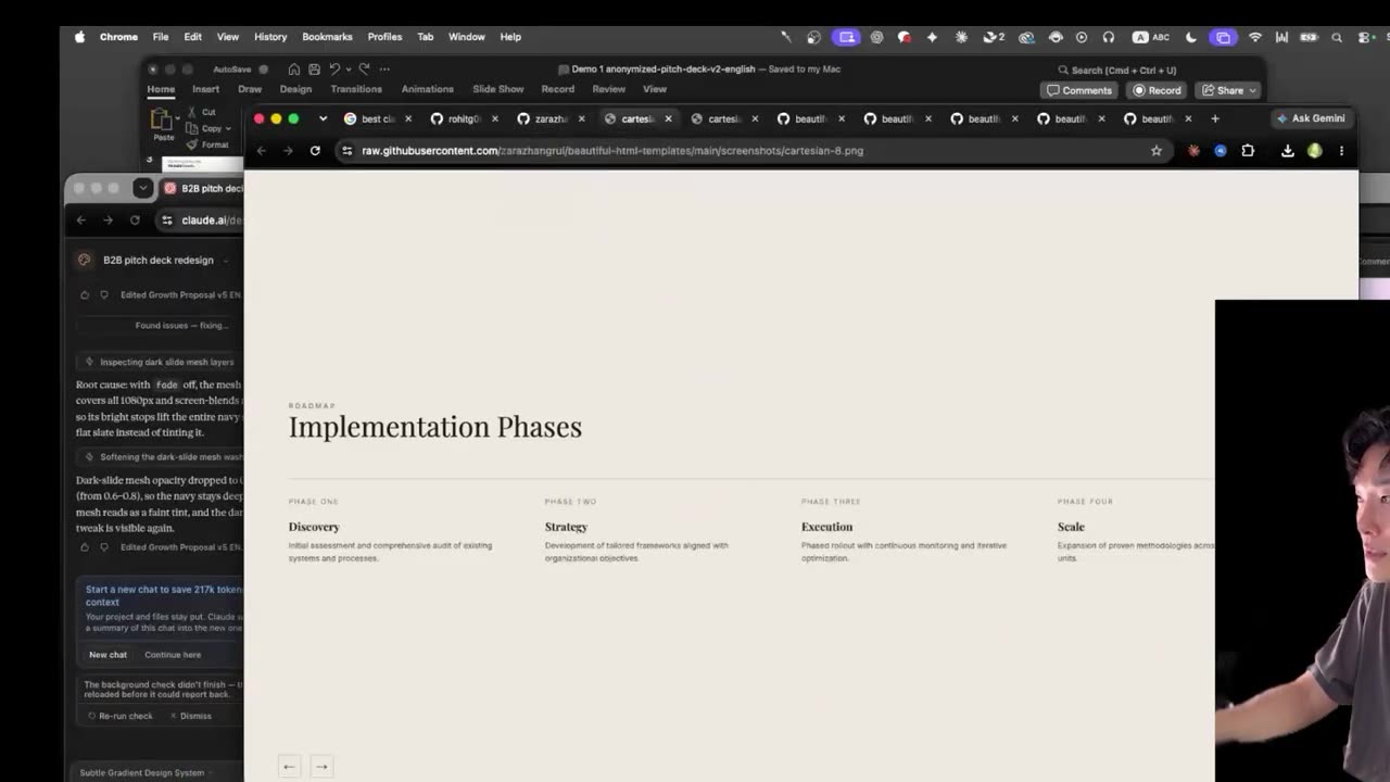
I did not write mine from scratch. I searched for the best Claude design slide deck templates on GitHub, because most of the big brands' design systems are published openly and you can just use them. I browsed the list, disliked most of it, nearly bounced, then landed on one called Cartesian. Minimal, no blocks, flowing. Clicking into it, there was already a design.md sitting in the repo. Downloaded, pasted in, done.
A few iterations later it still had not dropped the boxes and still had not found the color. So I attached the template HTML and said, roughly word for word: let's apply this template HTML I'm attaching, I don't like the layout of this deck, it's too sloppy with the two or three blocks. That was the whole instruction. Blocks gone, everything flowing, no hard lines.
The moment the boxes disappear is worth seeing rather than reading — one message, one render, and the card grid is gone.
Watch it at 9:54Then the tuning, which is where most people stop too early. I asked for variation in the gradient mesh intensity across slides, so the deck does not sit at one setting from start to finish. Some slides run stronger, some are deliberately subtle, and the density shifts as somebody browses through.
The instruction that changed the most: more white space means more gradient. Less text, more color. If a slide is crowded and the gradient is running everywhere behind it, you have two things competing and a reader who resolves the conflict by skimming. Where the slide breathes, the gradient goes strongest.
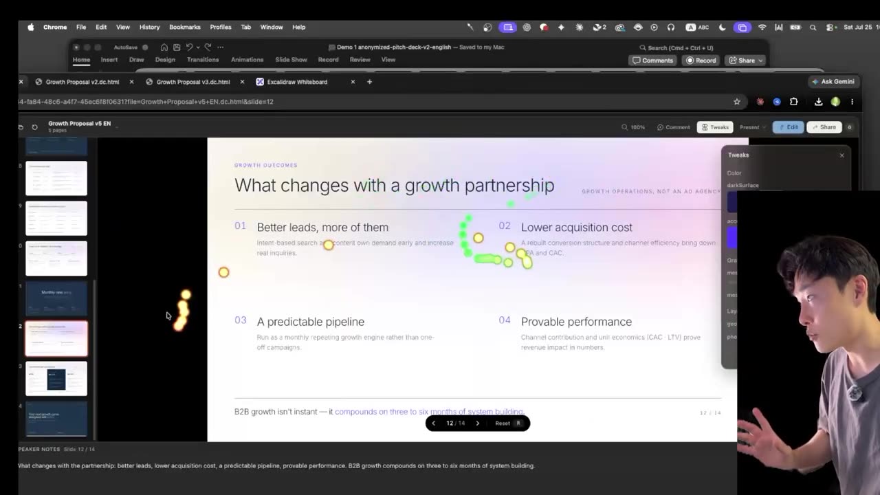
If you do not ask, you get one option, and one option is the average. Ask for a few palettes and a few intensity levels and choose. It costs one line of prompt and it is the difference between picking a design and accepting one.
Block 4: assets, because you show it rather than describe it
This is the real takeaway, and it is the thing that wasted the most of my time before I understood it.
I wanted a warm linen-canvas texture with a soft gradient behind it. I had seen it at an event hosted by a Zero Base partner alongside Y Combinator and a16z, where the pitch decks all carried this warm, slightly low-resolution palette with actual depth in the background. I liked it enough to want to steal the feeling.
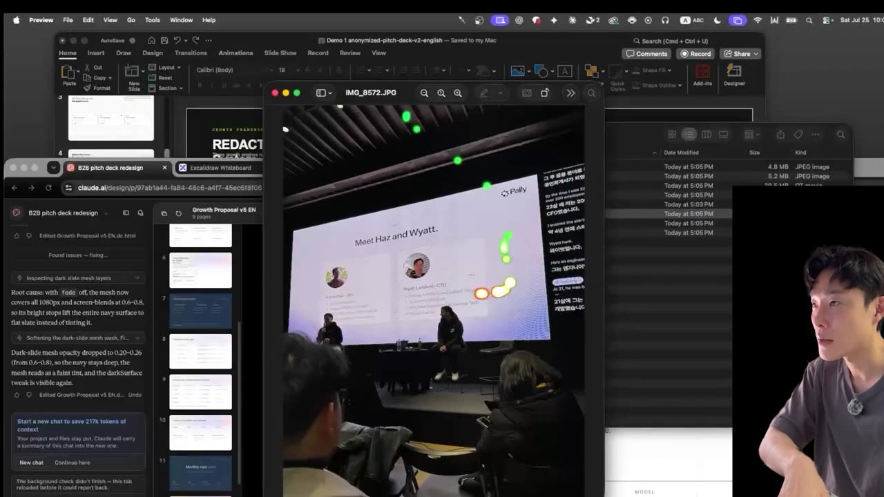
So I typed: warm linen texture, analog feeling, handcrafted. Garbage, every time. A model has never touched linen. It has a statistical median for the word and that median is nothing like the thing in my head.
Adjectives are a trap. Premium, clean, modern, handcrafted. Every model holds a different average for those words, and the average is precisely what you are running from. What works is handing over the actual thing: give it the file path to the photos and tell it to study them and get the gist of what you mean by warm and textured. Or give it a URL and say go browse this site, I want to recreate that feeling.
Then describe mechanically whatever the images cannot carry: mix these colors, avoid those colors, make the texture read as linen by adding a little depth, some scratches, and deliberately low resolution. The images set the target. The mechanics tell it how to hit it.
This is the same principle behind every good result I get out of an agent: specificity is cheaper than iteration. It is why a tighter agent runs 35x more efficiently and why the Nanobanana and Claude design pipeline produces animated sites worth charging for. Vague inputs do not save you time. They move the cost to round two.
What good design actually buys you
Let me be honest about what this does not do. Not every slide from one to fifteen is going to be interesting. Some of them are tables of numbers, and the viewer will drift off and think about lunch. Design is not what makes a boring slide interesting.
Design is what carries somebody through the boring slides to the part that matters, the part you actually want to sell. That is the whole job.
It also will not make a bad proposal good. If the strategy is weak, a beautiful animation will not save it. What it buys you is the attention to be judged on the strategy at all, which, when the person on the other side is reading forty of these a week, is not a small thing.
What the real deck did
The deck in this post is real, with brand and logos masked out. The founder closed a high-ticket business deal with it, and large, sceptical brands found it credible enough to keep reading.
That is the bar, and it is a lower bar than most people think — it is just one nobody clears with the default output. If you want more of this kind of work, the same approach is how I turn Claude into paid client output. More build logs live on the home page.
Four blocks. Keep the whole prompt concise. Then be creative inside the structure, starting with the only question that matters: what experience do you want the person on the other side to have?
See the deck change version by version
The video walks the same client deck from the neon-accent default to the finished warm-textured version, one block of the prompt at a time — including the exact wording that finally killed the card grid.
Frequently asked questions
Why do AI-generated pitch decks all look the same?
Because a model's default output is the average of everything it has seen, and the average is tidy. That produces the same three habits every time: one loud accent color doing all the visual work, grids of rounded cards, and no texture at all. Ask for a deck without constraints and you get the median deck.
Does this design prompt only work with Claude?
No. I built this deck in Claude Code, but the four blocks are a way of thinking rather than a feature. Guardrails, experience, design and assets work the same in Codex or Gemini, because every one of those models has the same problem: without constraints it returns the average of its training data.
What should I put in the guardrails section of a design prompt?
Mostly nevers, each paired with a replacement. Never accent bars on cards or text blocks. Never neon accent colors. Never box-and-card grids or rounded rectangles as containers. Then the always: asymmetric grids, hairline rules instead of card borders, content sitting directly on the page. Write never and always literally.
Why does AI ignore words like warm, premium or handcrafted?
It doesn't ignore them, it averages them. Every model holds a different median for premium or clean or handcrafted, and the median is exactly what you are trying to escape. A model has never touched linen. Give it images or a live URL to study, plus mechanical instructions about color, grain and depth.
Where can I find a design.md template to start from?
Search GitHub for Claude design deck templates. Plenty of design systems are published openly, and the good repos ship a design.md alongside the HTML. I browsed a list, disliked most of it, then found one called Cartesian that was minimal and flowing. I downloaded its design.md and pasted it in as my starting spec.