Almost everyone who sets out to build an animated website with AI gets the same website back. Same hero. Same gradient. Same three-column feature grid, same section order, same tasteful greys. You can spot it in a second, and so can whoever you were trying to impress.
I have a slightly unusual angle on this. I used to buy websites that were the most expensive in their category, with a full team of designers and programmers behind them, at $10–20K a build. As a VC partner I also sat across from a lot of founders raising rounds, and investors judge them on two artifacts: the website and the pitch deck. That's it. So the site has to be aesthetic, and it has to carry the story.
The site I'm about to break down was built with Claude Code, two generated video clips and a colour reference, on the $20 Pro plan. It's better than the ones I paid for. It also took a week and I hit the usage limit almost every day, so if an AI influencer tells you to one-shot something like this, they haven't built one. Here's the workflow, the prompt structure, and the two places it went wrong.
What you'll get out of this
- Why "build me a website that sells X" produces a generic site every single time — and what to prompt instead
- The three-part prompt structure that carried the whole build: reference, intent, constraints
- How two 8-second video loops cross-fade on scroll without reading as a hard cut
- What it really costs on the $20 Pro plan: limits, session tricks, and a week of revisions
- The Claude Code → git → Claude Design handoff, and the mistake that rebuilt the wrong site
Why AI-built websites all look the same
Most people prompt forward. "Build me a website that sells X." "Build me a site that resembles Y." The model has nothing to push against except its own average, so it hands back the median of every site it has ever seen. That's not a model failure. That's the prompt describing what you're selling, and a page that describes what you're selling is a brochure.
The prompt history for this build is not glamorous. It's weeks of back-and-forth on one machine, plus more on a second one, mostly consisting of me telling it what to remove.
Design backwards: start from the first second, not the sell
I don't start from what I want to sell. I start from how somebody lands on the page. What do they feel in the first second? What makes them go wait, what is this, then okay, that's actually cool, maybe a small laugh. That feeling is the thing you're designing. Everything after it is content.
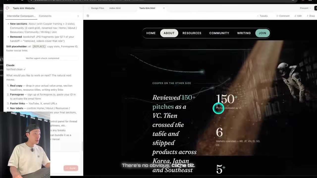
For this site the feeling was a specific scene: the tesseract sequence in Interstellar, where Cooper is floating in the bookshelf reaching through to affect the past. Every CTA on the page is meant to be that gesture — the action you take here changes what happens next. Abstract, sure. But it's a constraint, and a constraint is the one thing a model can't supply for you.
Three things multiplied the output quality more than any prompt trick:
- Revisions, at a volume that sounds unreasonable. I became genuinely good at Claude Code because of this one product. If you're not iterating anywhere near that much, you're leaving most of the quality on the table.
- Specify experience, not visuals. Every section has to answer "what does the user feel here," not "what does this section say."
- Invert the offer. The site isn't built around what I want to sell. It's built around what the visitor gets: they land, and they can see that taking action here might change something for them.
The prompt structure that works: reference + intent + constraints
People ask how the visuals got so specific. The answer is boring: I generate video and imagery in GPT image 2 or Nano Banana, paste those into Claude Code and Claude Design, and pair them with very explicit instructions about what I want and what I don't. Reference plus intent plus constraints. That's the whole structure.
The constraints half is where most people quit. Here's the shape of a real revision pass from the middle of this build:
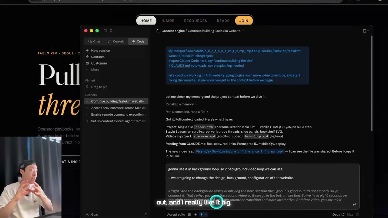
# revision pass — hero + bottom video
reference  two clips, 8s up top, 8s at the bottom
intent     smoother transition, more immersive, more interactive
constraint don't shrink the first video — I want it big
constraint kill the left bookshelf images, the video covers that
constraint cross-fade, not a cut, and not right at the CTA
constraint flip the second video 180° so the character sits left
Nothing in there is clever. It's just decided. The reason it works is that each line closes off an option the model would otherwise take on its own, which is exactly how you get off the template. The same instinct powers the four-step approach I use to turn Claude into a design collaborator rather than a slot-machine.
Where the video backgrounds actually come from
If you want a video background like mine, you bring your own. Generate one or film one — there's no prompt that conjures a usable clip out of nothing. The light in the hero started life as a ChatGPT image that I then animated into a loop. Once the reference exists, the rest of the work is mechanical.
The constraint nobody warns you about is quota. On a paid Gemini Pro subscription you get three video generations. Three. That is your entire budget for the look of the page, so the decision has to be made before you spend one.
How to cross-fade two video backgrounds on scroll
The single hardest part of the build wasn't visual, it was temporal. One 8-second loop at the top, one at the bottom, and the page has to hand off between them without the seam showing.
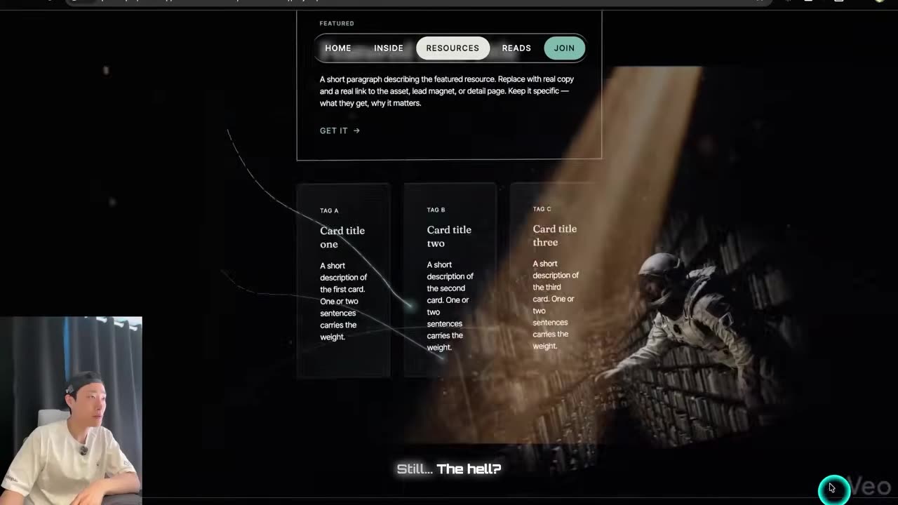
Two details make or break it. First, the flip: the hero character sits on the right, so the second clip is mirrored 180° horizontally to put its character on the left. Without it, the two collide in the middle of the frame during the fade and the effect turns into a mess.
Second, dead space — the page needs extra length at the bottom so the fade has room to happen without the sections overlapping each other.
The other seam problem was structural. The hero had three visibly cut edges where sections met, each one reading as a pasted square. The fix was a gradient fade at the boundaries so the sections blend into the background instead of stacking on it.
Getting a colour that isn't every other AI site's colour
The first build came back gold and orange, which is fine and also everywhere. I fed it thumbnails from a podcast as the colour reference and asked it to move the whole theme there — a green that isn't mint, near mint but not the mint everybody uses. My own colour, that sits well against red and plain white.
The first attempt landed too stale and too blue, so the follow-up got specific about which part of the reference image mattered: the brighter region near the person, not the darker stale areas. More glow, more gradient, brighter overall. That's the method in miniature — reference (the thumbnail), intent (a colour that isn't already everywhere), constraint (not stale blue, not mint, lean bright).
What a site like this actually costs
No designers, no programmers, no Framer, no Figma. A $20 Pro plan, against a $10–20K agency build with a full team on it.
The real cost is ceilings
The real cost isn't money, it's ceilings. I hit the five-hour Pro limit constantly, and got limit-conscious enough that I started opening fresh sessions purely to save tokens — the same discipline that made the difference when I cut an agent's usage by 35x.
Doing the bulk of the work in Claude Code and saving Claude Design for the final touch isn't a stylistic preference on Pro. It's the only way the budget works. On the $200 tier you'd have more room to iterate in one place.
Time cost: one week. The next one is under a day, because the prompts now exist and can be pasted. If you're building sites for other people, that gap between "one week" and "under a day" is the entire business — which is roughly how I think about actually making money with Claude rather than posting screenshots about it.
Claude Code vs Claude Design: which one does what
Claude Code does the build. Claude Design does the final touch. The handoff between them is a file, and getting that file right took one prompt: make me something I can import into Claude Design, with all the files and the necessary guidelines. What came back was a site handoff containing the entire site with inline JS and HTML, plus an architecture map.
Why the first handoff failed
Which is exactly how the first handoff failed. Claude Design came back having rebuilt a version of the site I'd abandoned days earlier.
It revived the old version. Are you kidding? I want a full refund.
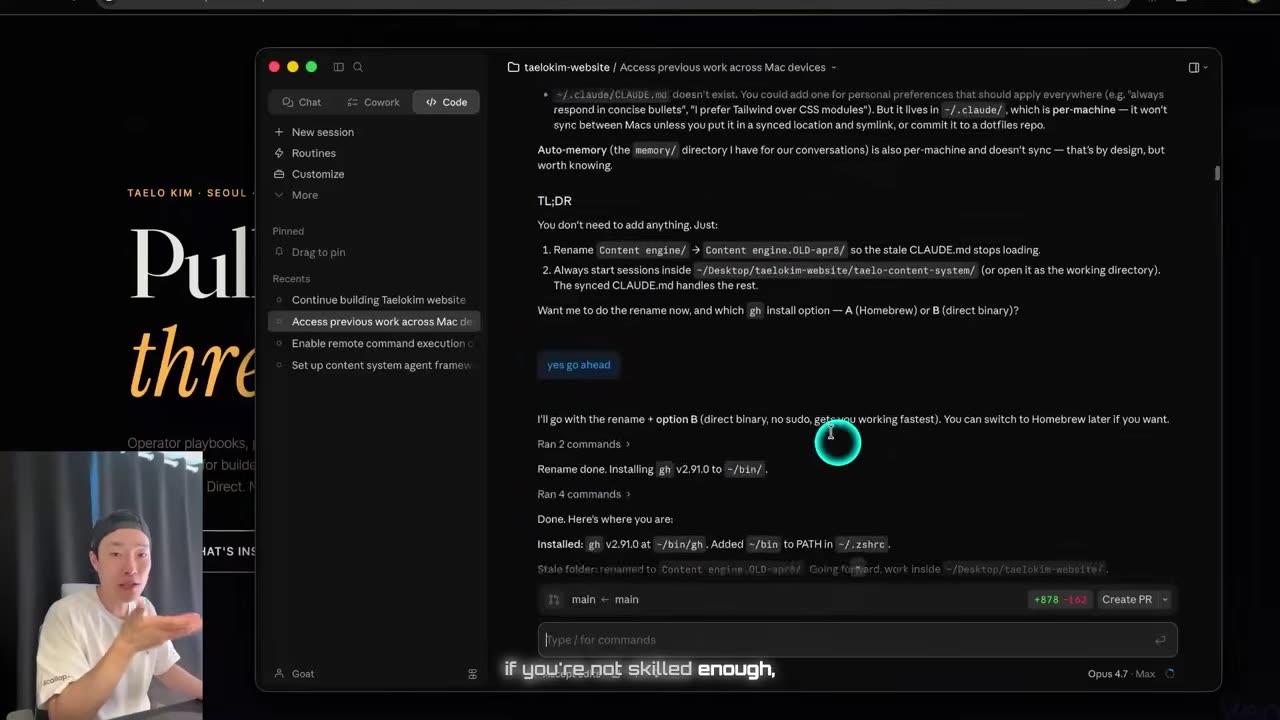
The cause was mundane: git wasn't pushed. Claude Design reads the repository, and the repository was behind my working tree, so it faithfully rebuilt the wrong site. The fix was to push everything, hand over the current link, and tell it to re-read and redo the job.
After that it was noticeably better — smoother motion, the hands meeting at the CTA, working navigation, the small animations on the YouTube, X and email icons, and none of the cliché tilt that gives AI-built pages away.
When the tweak regressed, I reverted to the last good version and finished in Claude Code. That's not a criticism of the tool so much as the actual shape of the workflow: the code environment holds the truth, and the design environment is a finishing pass you can walk away from.
The build order I'd use next time
-
Generate the reference before you prompt
Decide the feeling first, generate the still in Nano Banana or GPT image 2, iterate on the image, and animate only the frame you've committed to. Video generations are the scarce resource, not prompts.
-
Write the metaphor down before the layout
One paragraph on what the visitor should feel in the first second and why. This is the constraint the model can't invent for you, and it's what keeps the output off the template.
-
Build the whole thing in Claude Code
Structure, scroll behaviour, video layering. Prompt in reference + intent + constraints form, and always say what you don't want alongside what you do.
-
Push to git, then hand off
Export a handoff file with the entire site inline plus an architecture map, push the repo, and give Claude Design the link to the current version. Say "current version" explicitly.
-
Final touch, then get out
Use the free tweaks for small adjustments, check nothing regressed, and go back to Claude Code the moment a tweak eats a feature you already shipped.
That's it. A site that beats what I was paying agencies $10–20K for, with no team, no Framer and no Figma. Just Claude, the right references, and being specific about what you actually want. If you want to see how the finished thing behaves, it's the approach I use across everything on this site.
Watch the parts that didn't work
The scroll cross-fade being tuned live, the colour pass landing in two prompts, and Claude Design confidently rebuilding the wrong website — 18 minutes, unedited around the failures.
Frequently asked questions
Can Claude Code build a website with animated video backgrounds?
Yes. Claude Code handled the structure, the scroll behaviour and the layering of two 8-second video loops that cross-fade into each other. What it cannot do is invent the video. You bring the asset, generated or filmed, and Claude Code wires it into the page. Expect many revision passes rather than one shot.
Do I need the $200 Claude plan to build a site like this?
No. This site was built on the $20 Pro plan. The trade-off is time: I hit the five-hour usage limit constantly and started fresh sessions purely to save tokens. On Pro, do the bulk of the build in Claude Code and save Claude Design for the final touch. A higher tier mainly buys you room to iterate without stopping.
Why do AI-generated websites all look generic?
Because the prompt describes what you are selling. Build me a website that sells X gives the model nothing to push against, so it returns the median of everything it has seen: same hero, same gradient, same three-column feature grid. Give it a real reference asset, a stated feeling and an explicit list of what you do not want.
How do you get video backgrounds for an AI-built website?
Generate a still first in Nano Banana or GPT image 2, then animate that still into a short loop. On a paid Gemini Pro subscription you only get three video generations, so iterate on the image, which is cheap, and animate only the frame you have already committed to. Filming your own clip works just as well.
Why did Claude Design rebuild an old version of my site?
Because it reads your git repository, not your local working tree. Mine pulled a state from before my latest commits and rebuilt the wrong site. Push everything, then tell it explicitly to re-read the repo and redo the job. The same rule applies to the handoff file: it has to point at the current version.